Q2. HOW DOES YOUR MEDIA PRODUCT REPRESENT PARTICULAR SOCIAL GROUPS?
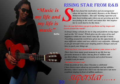
My front cover
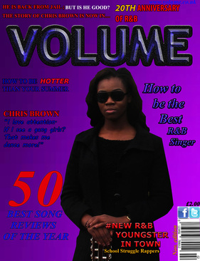
My front cover involves a female who is looking straight towards the camera. This would appeal to female slightly although there might be some features on the cover which might suite male . The young lady is dressed in a black coat, wearing a dark glasses and lying on the guitar. Females would be more attracted to my music magazine than male since it looks more serious and attractive. Although, the colour of the texts and the size of it would mostly attract young males since blue symbolise calm. This makes it blends with the background. My model is young which suite my target group because they are 16-21 years. My model is a black young lady which will associate more with black background than other ethnicity since she is black. The pose of my main image would attract more middle class since he looks cool and calm.
Colour scheme
My colour scheme on my front cover consistent of blue, yellow and red which appeal to both genders. The blue colour is mostly used on the front page which associate more with male since it symbolise calm and confident. The red colour is more appealing to female since it represents love and passion. Lastly, yellow colour can relets to both genders since it creates joy, energy and intellect. Using these colours blends with each other to create harmony and variety in our society.
Compare My front cover with other music magazine
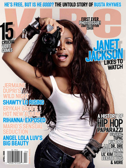
I decided to find other music magazine such as R&B to see how they targeted their target audience. R&B have a colour scheme of light blue, black, white and light brown. They have included an artists who will associate with their target audience. Since millions of people around the world listen to R&B, they would like to read the magazine since R&B are popular around the globe. Moreover, using a female model posing in a sexy way could attract more females than male since teenage females would want to be like them. This front cover could associate with posh middle class family and all race since the artists is mix race.
Contents page
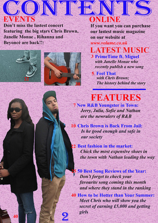
This is my contents page and there are many images and texts on it. The main image of my contents page is placed at the left button of the page. The female is holding a guitar, wearing glasses and looking straight at the camera. Whiles the male is dressed in a light blue hoodle with his hand in his pocket. Overall, this image gives an impression about how young people dressed and what they like to do. This would associate with both genders and a working class. On the other hand of my contents page there is a picture of someone wearing a nike trannies. This shows how teenagers especially young boys like to wear which makes them look unprofessional. Lastly, there is a guy playing a guitar which shows that this is his passion and this is what he enjoys doing in his free time. With these pictures it creates a multicultural and represents both gender creating a sense of belonging and welcoming.
COMPARE MY contents page WITH OTHER MUSIC MAGAZINE
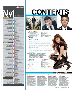
This is 'Billboard' music magazine contents page which has similarity and differences with my contents page. To start with, they used a popular artist who is known around the world as the main image. The artist is a white race who is kneeling on her left kneel with a sunny smile on her face. With this as a main image this would mostly attract white race and young female. The colour scheme on the includes light blue, black, red and yellow. With these colours this associate more with both genders.
Double PAGE SPREAD
This is my final double page spread. I placed my main image at the left side of the page. She is holding a guitar , looking at the camera with a smile and dressed in a fashionable way which would attract my target audience but mostly young ladies. Also it is the tradition way for making a double page with the texts on one side and the main image on the other side. I used a colour scheme which would associate with both genders. For example, the blue colour represents confidence and intelligence which associate more with males than female. With my double page spread background, I try to balance the colour scheme by placing the black colour at the left side and the white colour at the right side. This would make it unique and blends with the texts effectively. This would make it appear to both gender.
