MUSIC MAGAZINE CONTENTS PAGE(1)
The title 'CONTENTS' which is suitable to his reader and gives them what articles and genres in the music magazine. It is in block letters which makes it catchier to the eye and stand out. It also blends well with the white background.
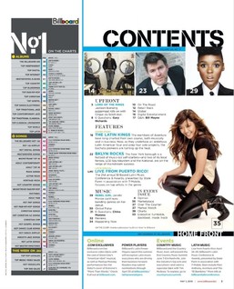
The name of this magazine is 'BILLBOARD' which is used in different colours at the left top hand of the page which makes it rare from other type of magazine contents page. Many people will recognise this name because it is popular. The contents page is divided into two pages with a blue line which makes it clear and straightforward to read. The page is mainly used in blue, black, grey and white which looks more organised. It is suitable for a quick overview.
Underneath, the 'CONTENTS' there are three pictures. This images includes a lady with a surprised face, a man looking up and a man walking which will help draw more attention from the reader to the magazine which would influence him to buy the magazine and find more about it. These are all artists and they relate to the magazine. Moreover, there is a main image of a musician who has crouched down on her left kneel, smiling and looking at the texts. Showing the reader to also look there as well which makes it feel welcoming and inviting.
The layout of this contents page is a bit overcrowd with lots of information on it. However, they are split into subtitles, 'upfront', 'features', 'music' and 'every issue' to help the reader find what they are searching for. There are page numbers next to images at the top of the page and main features. They are in black colour to make them stand out to read and it makes it simply to know what page it is on and get them involve. Furthermore, there is a 'Home Front' which the reader can also see the latest news online or attend events.
At the left side of the page, there are columns which show the songs in the chart. There are many different charts which will serve as a source to attract more people to the magazine.
