COLOUR SCHEME
Definition of colour scheme?
It is an arrangement or combination of different colours used in an inner design for a range of media. Colour is one of the significant things we use in different aspect of our profession such as art and design.
Different colour scheme are used for different purposes such as to set mood, attract attention or make a statement which could be difficult to find the good colour palette. For example, colour red is used to signify passion, love, energy or danger depending on how you presents to your target audience. On the other hand, blue could be used to symbolise life, water and sea.
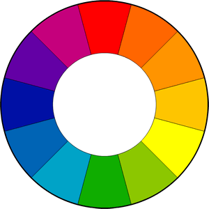
The colour wheel and colour schemes: The colour wheel was introduced in 1666 by Sir Isaac Newton which represents arrangements of chromatic relationship. Also, the different between colour wheel and colour schemes is that colour wheels are combing colours, whiles colour schemes are wheels made of logical combinations.
Types of colour schemes:
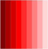
1) Monochromatic colour scheme is made up of same colour, different tints and shades of tones, which makes it easy to use and understand. This makes it effective and creates different diversity of hues.
2) Analogous colour scheme are colours on the wheel which are next to each other which match quick perfectively. This types of colours can be find in the natural world such as green and blue.
3) Complementary colour scheme are elements located across each other on the colour wheel which tends to creates high contrast and energetic look. This makes you to know the elements to stands out for example blue and orange.
4) Split-Complementary colour scheme is a variation of the matching colour scheme such as two primary colours and two adjacent colours to combine. This makes it strong in visual contrast.
My colour scheme:
For my music magazine I have decided to use monochromatic colour scheme of red and blue. Using this combination makes it very clean, fresh and represent particular gender or age group of my target audience.
It is an arrangement or combination of different colours used in an inner design for a range of media. Colour is one of the significant things we use in different aspect of our profession such as art and design.
Different colour scheme are used for different purposes such as to set mood, attract attention or make a statement which could be difficult to find the good colour palette. For example, colour red is used to signify passion, love, energy or danger depending on how you presents to your target audience. On the other hand, blue could be used to symbolise life, water and sea.
The colour wheel and colour schemes: The colour wheel was introduced in 1666 by Sir Isaac Newton which represents arrangements of chromatic relationship. Also, the different between colour wheel and colour schemes is that colour wheels are combing colours, whiles colour schemes are wheels made of logical combinations.
Types of colour schemes:
1) Monochromatic colour scheme is made up of same colour, different tints and shades of tones, which makes it easy to use and understand. This makes it effective and creates different diversity of hues.
2) Analogous colour scheme are colours on the wheel which are next to each other which match quick perfectively. This types of colours can be find in the natural world such as green and blue.
3) Complementary colour scheme are elements located across each other on the colour wheel which tends to creates high contrast and energetic look. This makes you to know the elements to stands out for example blue and orange.
4) Split-Complementary colour scheme is a variation of the matching colour scheme such as two primary colours and two adjacent colours to combine. This makes it strong in visual contrast.
My colour scheme:
For my music magazine I have decided to use monochromatic colour scheme of red and blue. Using this combination makes it very clean, fresh and represent particular gender or age group of my target audience.

|
|
