MUSIC MAGAZINE FRONT COVER(1)
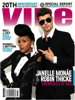
The music magazine has a masthead 'VIBE' which is in bold & capital underneath the '20th anniversary'. This makes it stand-out and attract the target audience from any point of view to buy the magazine. The 'B' is not visible and this means that this magazine is well known and many people will recognise it anyway. Also, it is the biggest font on the page to make it as big as possible. This also makes the reader realise that it was published by 'VIBE' and the use of purple to symbolise royalty which is associated with girls and creates a sense of welcoming to the reader. It makes the title fluent throughout unlike other magazine.
The layout of the page is balanced in the way the man and woman are posed at the front cover, which makes it clear to read. Moreover, the texts on the music magazine cover is in light blue, black and purple with the white background. The use of these three colours creates a pattern on the page and blends with the background. The use of these colours creates a classy shine.
This front cover magazine includes Janelle Monae who is psychedelic soul and R&B singer-songwriter, composer and Robin Thicke who is also singer-songwriter, musician, and actor. This celebrities will serve as a purpose to attract millions of people around the world to the magazine. This two celebrities singers directly links to the 'VIBE' magazine to the R&B scene.
The iconography of the male and female shows sharp dress in high quality black suites to show they are from upper class. The man's head is slightly to the left which makes has body unbalanced. Robin Thicke is also wearing black glasses although his face is penetrating towards the reader with his left hand pointing towards Janelle. This could indicate that, Robin is inviting his target audience to check something out. On the other side of the pose, Janelle is pulling the man's hand to show that she should fellow her and suggests that she is in control of the man. In addition, she is putting her right hand on her hips to show that life is comfortable and smooth for her. The way Janelle and Robin are posed links with the texts '#NEWRULES OF R&B' shows they are fashionable as they are both artists who compose music under the genre of "R&B". They have information about the new rules of R&B, so the magazine knows the future of R&B. The statements is in pink from the rest of the names of celebrities to appeal and attract their target audience. The two stars show a dynamic and playful pose. They invite the reader to find more about them.
They look glamorous and the cover appeals more to young fashionable readers. The target audience is R&B fans, male and female, black and white. This type of R&B is more associated with smooth upper class rather than gritty lower class. It remands me of 'MIB'.
There is a barcode at the left bottom of the page to make it easier for sellers to purchase the item quickly to their customers which makes it quickly and convenient. Also, it is smaller compared to the other concepts on the front cover which shows it is less significant. There is a selling line at the top of the page such as '20th anniversary collector's issue ' which represents that they are celebrating when 'R&B' first existed. Notice, the 'Anniversary' is in different colour than the rest of the statement making it significant. Moreover, 'special report inside Kanye's Creative Cult' will influence their target audience to buy the magazine because the reader would want to find the latest news about the American rapper. Both the 'Anniversary' and 'Kanye' were in light blue to associate with peace, spiritual and infinity.
There are different texts on the front cover to show the genre and articles in the magazine such as 'Nas & J.cole school struggles rappers' suggests how young people in the society are growing up to become like these celebrities. It also shows how these young guys have become popular both in their school and the community. The alliteration of 'school struggle rappers' creates an effect of rebellion to society.
MUSIC MAGAZINE FRONT COVER(2)
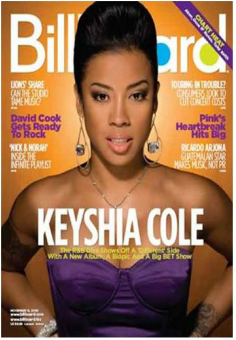
The music magazine has a masthead of 'BILLBOARD' which is written in bold letters. Although, the 'L', 'B' and 'O' is visible since the lady's hair is standing at the front of it. Most music fans will notice that anyway that it is a 'BILLBOARD' magazine and this shows that it is popular. Notice that the 'A' and 'B' is coloured in light blue and light yellow meaning that it is part of their logo which makes it unique from other brands. These colours make it playful and less formal. In addition, the background is a dark shade of orange which blends with the masthead and makes the other texts easily to read. Also, the background gives the skin colour an extra glow.
There is also an advert of 'CHART HEAT' which will give their target audience the opportunity to know about Alan. This advert is in yellow, purple and white making it stand out to their target audience. The rest of the texts on the music magazine also have these colours. It creates a unique pattern on the front cover. The company used yellow to symbolise happiness; purple to symbolise peace and mystery.
The way the iconography is posed on the front cover of the magazine helps to balanced the texts, making it simple to read from any point of view. The main image(Keyshia Cole) is an American singer, songwriter, record producer and television personality who has dressed in purple colour which is also associated with other selling lines at the front cover making it significant with the neat co-ordination. Keyshia has a eye contacts with the reader and her target audience showing that they should buy her. She also have expensive items such as eye rings, necklaces and wrist jewellery showing she comes from a posh family and shows her status in life. The tattoo makes her look very individual and slightly rebellious. The mid-shot photo of the celebrity makes her alluring as her body looks in charge. The name of the celebrity 'KEYSHIA COLE' is written at the middle of the front cover with a white colour making the layout neat and well organised which looks more appealing to the reader.
'Reveals a new side to her' is under her name which makes her target audience even more curious about the star. The target audience for Billboard is mostly young people between the age of 14-26. The reason being is that, they like different genre and latest update from chart. It is more likely targeted at females than males with the use of more purple colours. It is also more associated with upper class and black people.
There are many headlines which will get millions of readers involved and would like to find more about it such as 'David Cook gets ready to rock'.
